Narrative by Design: Crafting Stories Through Bold Visuals
In my work, storytelling meets graphic design to create visuals that do more than just catch the eye—they connect and communicate on a deeper level. Each design I create is crafted to tell a story, using bold colors and dynamic shapes to convey a narrative that resonates with the audience. By blending the art of storytelling with graphic design, I ensure that every piece not only looks striking, but also delivers a message that sticks with viewers long after they've seen it.
〰️
print 〰️
Poster/Print Design
My approach to designing for printed materials is centered on storytelling, vibrant visuals, and meticulous attention to detail. I aim to create designs that are not only visually engaging, but also convey a deeper narrative, connecting with the viewer on an emotional level. Whether working on poster designs, sticker collections, or exhibition booklets, I leverage a range of tools such as Adobe Illustrator, Canva, and InDesign to experiment with typography, color, and layout. This process allows me to craft unique and memorable designs that stand out in print, capturing the essence of the project while pushing the boundaries of traditional aesthetics.
Coffee Fellows Flyer Design Project- Adobe Illustrator and Canva - 2024
Client: Coffee Fellows
Year: 2024
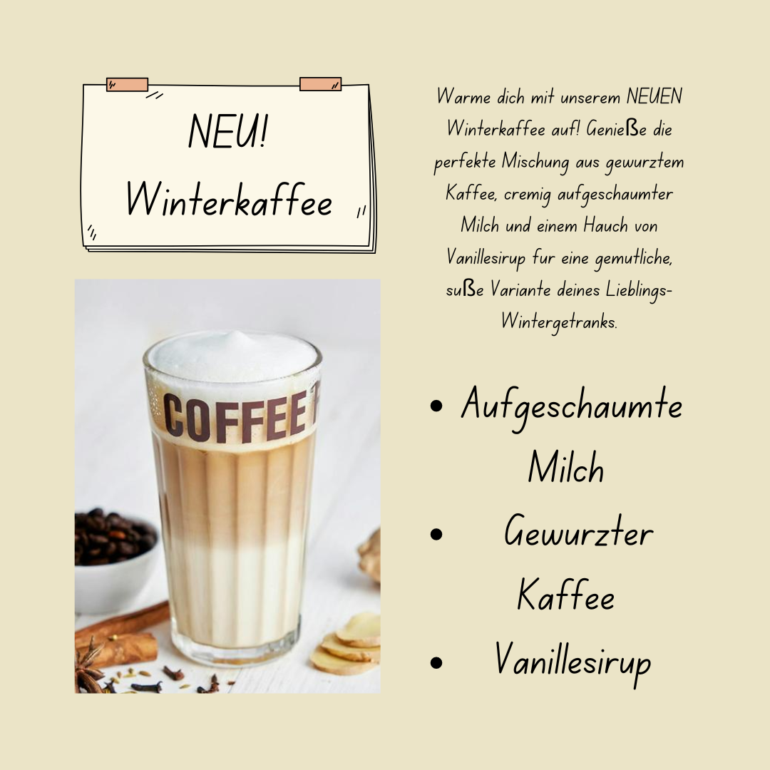
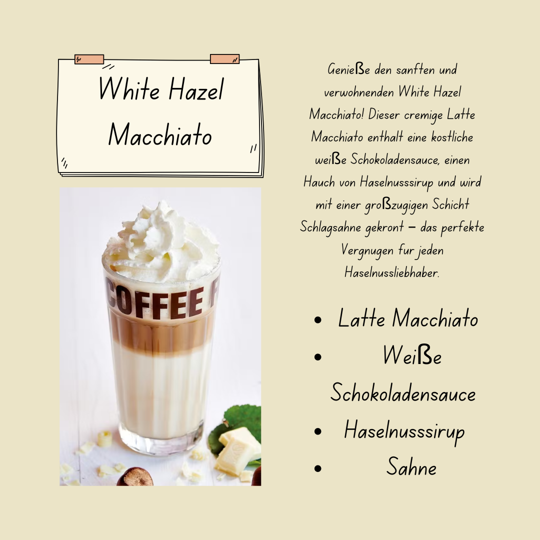
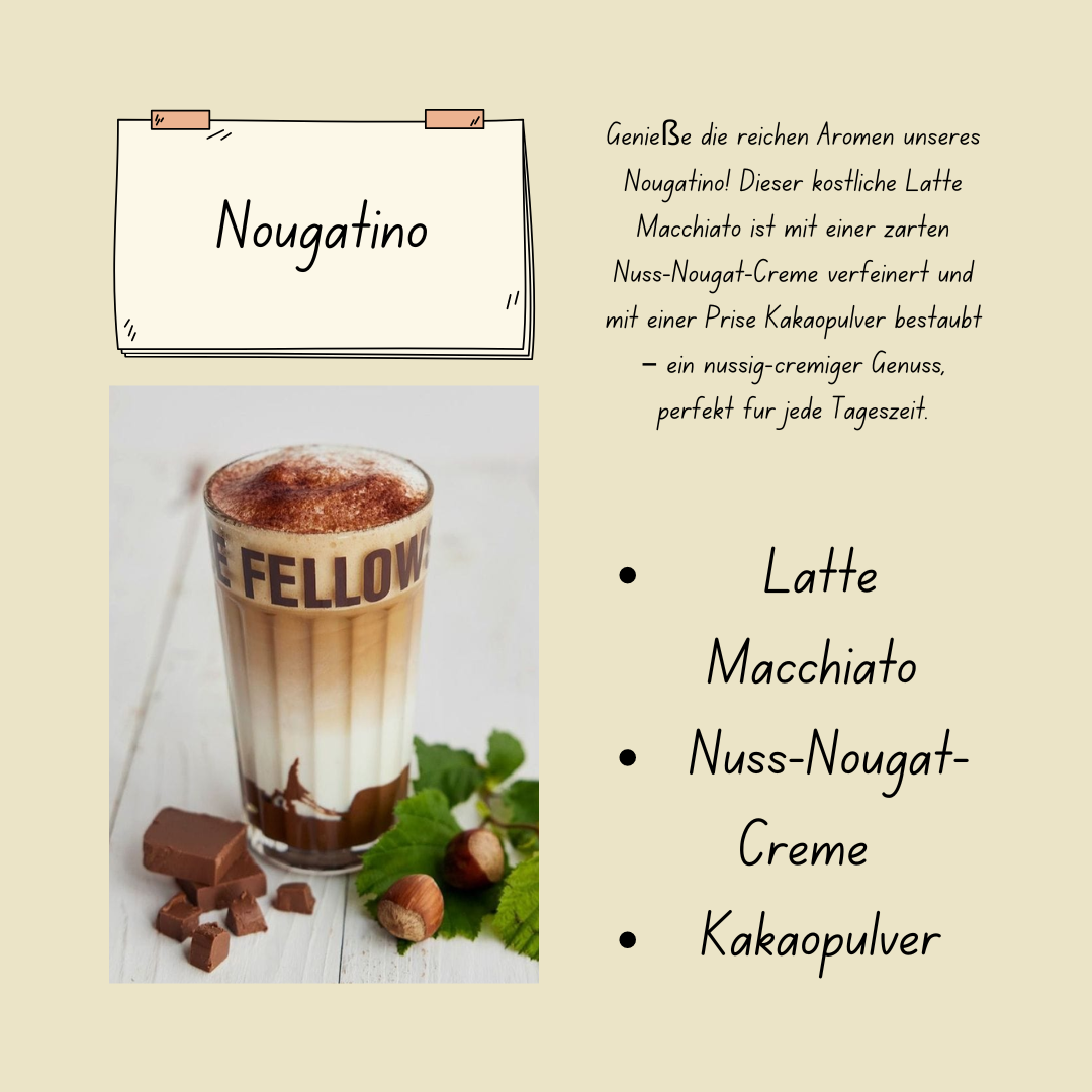
This series of flyer designs was created as an exploration of branding and graphic design within the framework of Coffee Fellows’ distinct visual identity. Inspired by the brand’s modern and inviting aesthetic, I aimed to craft materials that reflect their tone while showcasing my personal artistic approach.
The image displayed at the top of this section exemplifies my ability to stay true to brand guidelines while infusing the design with my own creative flair. The composition, color choices, and typography align with Coffee Fellows’ established style, but subtle artistic touches make it uniquely mine, creating a balance between adherence and innovation.
The other designs in this collection strictly follow the company’s branding rules, reinforcing my ability to create cohesive marketing materials that meet professional standards. This project highlights my versatility as a graphic designer, demonstrating how I can work within an existing visual language while still contributing fresh and original ideas.
Exhibition Poster Design - Adobe Illustrator
Client: UE Germany (Berlin Campus)
Year: 2024
During my graduation exhibition at university, I had the opportunity to participate in a highly anticipated poster design contest. The contest was a significant event, offering students the chance to showcase their creativity and design skills. We were given complete creative freedom, allowing us to explore any concept that we believed would resonate with the theme of the exhibition.
The designs from previous years set a high standard, featuring innovative uses of gradients, metallic textures, and eye-catching, unconventional graphics. These designs pushed the boundaries of traditional poster aesthetics, which both inspired and challenged me. Recognizing that the university encouraged bold and less traditional approaches, I decided to take a risk and submit a design that was distinctly my own.
I began by experimenting with Adobe Illustrator, using the pencil tool, to create abstract squiggles that formed the foundation of my design. I then applied gradient effects to these elements, leveraging the versatility of the gradient tool to add depth and vibrancy to the composition. This process was both a creative exploration and a technical exercise, as I sought to balance complexity with visual harmony. The gradients, in particular, became a focal point of the design, allowing me to play with color transitions and light effects in a way that felt fresh and dynamic.
To complement the abstract elements, I carefully selected a classic typeface that provided a striking contrast to the modern, fluid design. The typeface choice was deliberate; I wanted to anchor the design with a sense of timelessness while still embracing a contemporary aesthetic. The juxtaposition of the traditional font with the abstract, gradient-rich background created a unique visual tension that I felt captured the essence of the event.
Ultimately, while my design did not win the contest, the experience was invaluable. It allowed me to push my creative boundaries and refine my technical skills, particularly in the use of Illustrator. Moreover, it reinforced my belief in the importance of taking creative risks and staying true to my vision, even in a competitive environment.
This project is a testament to my ability to adapt, experiment, and innovate—qualities that I am eager to bring to new challenges in the field of graphic design. I am proud of the work I produced and confident that it reflects my passion for design and my commitment to continuously improving my craft.
Caught on Tape: Sticky Icons Exhibition Booklet – Adobe InDesign 2023
Client: Tape Over Berlin GMBH
Year: 2023
For the "Caught on Tape: Sticky Icons" tape art exhibition in Berlin, I designed a booklet that serves as an engaging guide for visitors. This booklet provides context about the historical periods featured in the exhibition, insightful information about the artists, and detailed descriptions of the pieces on display.
To enhance the visitor experience, I chose a unique layout that prominently displays the number of each artwork alongside its title, making the titles stand out more than the artists' names. This design choice not only adds a touch of elegance but also creates a visually satisfying composition that directs attention to the art itself.
Given the budget constraints for printing, the booklet is designed in grayscale. The entire project was crafted using Adobe InDesign, leveraging its advanced tools to create a clean, professional, and aesthetically pleasing layout. This booklet successfully merges functionality with style, making it a memorable takeaway for exhibition visitors.
Fun Pack Sticker Design - Adobe Illustrator
During my time at Tape Over Berlin, I had the opportunity to design a sticker for their Tape Art Kits, a project that allowed me to combine creativity with functionality. Working closely with my team, I developed a concept that was both visually compelling and perfectly aligned with the product’s artistic vision.
The design process began with hand-drawn sketches, which I then translated into Adobe Illustrator while staying true to my distinct art style. My goal was to create a "paper cutout" effect, giving the impression that the typeface was intricately carved from the tape sheets themselves. This design approach was inspired by the tactile nature of tape art and the creative possibilities of layering different tapes to produce unique visual effects.
For the neon pack, I chose a vibrant color palette of neon pink, neon blue, and highlighter yellow, drawing inspiration from CMYK printing techniques. This selection was meant to capture the energy and intensity of these colors, which some consider to be the true primary hues. Additionally, I developed a monochrome tape kit, using the stark contrast of black and white to emphasize the interplay of shapes and layering.
The client was extremely pleased with the final designs, which will be featured in the upcoming Tape Art Kits. This project allowed me to explore new creative techniques and demonstrated my ability to deliver designs that meet both aesthetic and functional objectives.
Client: Tape Over Berlin GMBH
Year: 2023
Pride Sticker Collection- Adobe Illustrator and Canva- 2022
Client: Myself (Aspens Spilled Ink)
Year: 2022-23
This sticker pack includes three designs that are particularly meaningful to me, reflecting my creativity and passion in a way that promotes awareness of my own identity.
Design 1: "This is Home" Sticker
The first design was an assignment for my Adobe Illustrator class at university, where we were tasked with creating a sticker inspired by a song we liked. I chose "This is Home" by Cavetown, a song that resonates deeply with the transgender community and has become a trans anthem. To reflect the themes of the song and the community it represents, I incorporated the colors of the transgender pride flag: pink, blue, and white. I used these colors to create a dreamy, star-filled background that evokes a sense of comfort and belonging, which is central to the song’s message.
The lettering for this design was intentionally styled in a dreamy, alternative fashion, aiming to capture a DIY, zine-like feel that many in the queer community resonate with. This design wasn’t just a classroom project; it was a personal expression. I went on to print these stickers and sell them at Queer Berlin Markets, where they received a warm reception. Seeing so many people connect with the message and aesthetics of the design was incredibly rewarding.
Design 2: "Trans Rights are Human Rights" Sticker
The second design emerged while I was browsing Canva. I stumbled upon a bubbly typeface with soft lines that immediately struck me as perfect for a sticker design. Inspired by its playful and welcoming vibe, I decided to experiment with different color palettes and phrases that could resonate with the queer community.
After some experimentation, I settled on the phrase "Trans Rights are Human Rights."
For the color scheme, I chose a bold blue font set against a vibrant yellow background, creating a striking contrast that makes the message clear and visible. To subtly honor the pansexual pride flag, I added some background elements in colors that correspond to the flag, adding depth and texture to the design.
Design 3: Pronoun Stickers
The third design in this pack is a set of pronoun stickers that I created for an event at my university. Every year, we host "Ersti Days," where new students come to campus for the first time. I designed these stickers to help students easily communicate their pronouns, a practice I believe is crucial for fostering inclusivity and respect. As a trans person, I understand the importance of normalizing the sharing of pronouns to create a welcoming environment for everyone.
The concept for these stickers originated in my typography class. They came from an assignment, that I decided to turn into a real project. Using Adobe Illustrator, I crafted a variety of designs featuring different pronouns with vibrant backgrounds and clean, legible typography. The aim was to make these stickers visually appealing while ensuring the pronouns were easily readable, facilitating smoother and more inclusive interactions among students.
Socials
〰️
Socials 〰️
Social Media Design
My approach to social media design focuses on creating visually compelling and strategically effective content that captures attention and communicates key messages clearly. By blending creativity with clear communication, I design posts that engage and inform audiences while staying true to brand aesthetics. Using tools like Adobe Photoshop, Illustrator, and Canva, I craft dynamic visuals with thoughtful typography, vibrant color palettes, and unique design elements to enhance the social media presence. My designs are carefully tailored to maintain brand consistency and foster community engagement, ensuring each post resonates with its intended audience.
Expresso House Autumn Instagram Posts - Adobe Illustrator and Canva - 2024
In this practice project, I created a series of Instagram graphics to promote Espresso House’s seasonal fall menu, using Canva and Adobe Illustrator. Although this project was not commissioned, I closely followed the brand’s style guide, ensuring consistency in typography, color schemes, and overall tone. The designs emphasize the warm, inviting feel of autumn, with soft beige and muted green backgrounds that complement the rich, seasonal imagery of pumpkin lattes and buns. Each graphic highlights key fall products, such as the Pumpkin Spiced Chai and the 2x Bun Package, with clean layouts that make the offerings the focal point, while maintaining a cozy, engaging aesthetic.
The typography and layout choices were made to guide the viewer’s attention directly to the featured products, while still adhering to Espresso House’s visual identity. Subtle coffee bean icons and cinnamon accents were added to enhance the autumnal atmosphere and tie back to the core elements of the brand. This project demonstrates my ability to balance creative freedom with brand adherence, delivering eye-catching visuals that evoke the cozy, comforting mood of the fall season. Through this work, I show my capacity for creating cohesive, engaging content that can elevate a brand’s digital presence, even in a practice setting.
Client: Espresso House GMBH
Year: 2024
Coffee Fellows Instagram Carousel - Adobe Illustrator and Canva - 2024
For this practice project, I designed a six-slide Instagram carousel to promote Coffee Fellows Germany's new autumn drinks. Using a muted color palette inspired by their branding, I aimed to create a cohesive, inviting visual experience that reflects the cozy and warm vibes of the season. Each slide highlights a different drink, showcasing a balance of text and imagery to engage the audience while delivering key information about the beverages.
I used a combination of Adobe Illustrator for the custom illustrations and layout work, and Canva to fine-tune the overall design. This project is a great example of my ability to adapt brand aesthetics into social media-friendly content, perfect for product launches, promotions, or seasonal campaigns. The carousel is ideal for brands looking to maintain consistency while introducing new offerings in a visually appealing way.
Client: Coffee Fellows GMBH
Year: 2024
Crypto Thumbnails and Graphics- Canva and Adobe Illustrator
Client: Crypto Current
Year: 2021
As a contracted graphic designer for Crypto Current, I created visually compelling, brand-consistent graphics that aligned with the company’s dynamic presence in the cryptocurrency industry. Below are some of the projects I worked on:
1. Pride Month Graphic for Crypto Opinions Page
To celebrate Pride Month, I designed a special visual for Crypto Current’s "Crypto Opinions" page, focusing on resources for queer individuals in the crypto community. The design featured a deep blue background to signify the brand's special edition content, paired with a vibrant array of pride flags held by illustrated figures. To enhance the celebratory theme, I utilized a bold, fun, and poppy font, incorporating a spectrum of colors to resonate with the diversity and inclusivity of Pride. This project highlights my ability to blend thematic elements with brand aesthetics, using assets from Canva while adhering to the company's guidelines.
2. Podcast Graphic for Guest Appearance—Party Shirt
This project was one of my favorite creations for Crypto Current. Designed for a podcast episode featuring the guest Party Shirt, the visual needed to balance the distinct brand identities of both Crypto Current and the guest. Working within the constraints of a design guide, I crafted a bold and memorable graphic using a light blue background with a white border, which was a staple look for the brand. Through the use of Adobe Photoshop and Canva, I implemented dynamic typography and striking elements to ensure the design stood out while remaining on-brand.
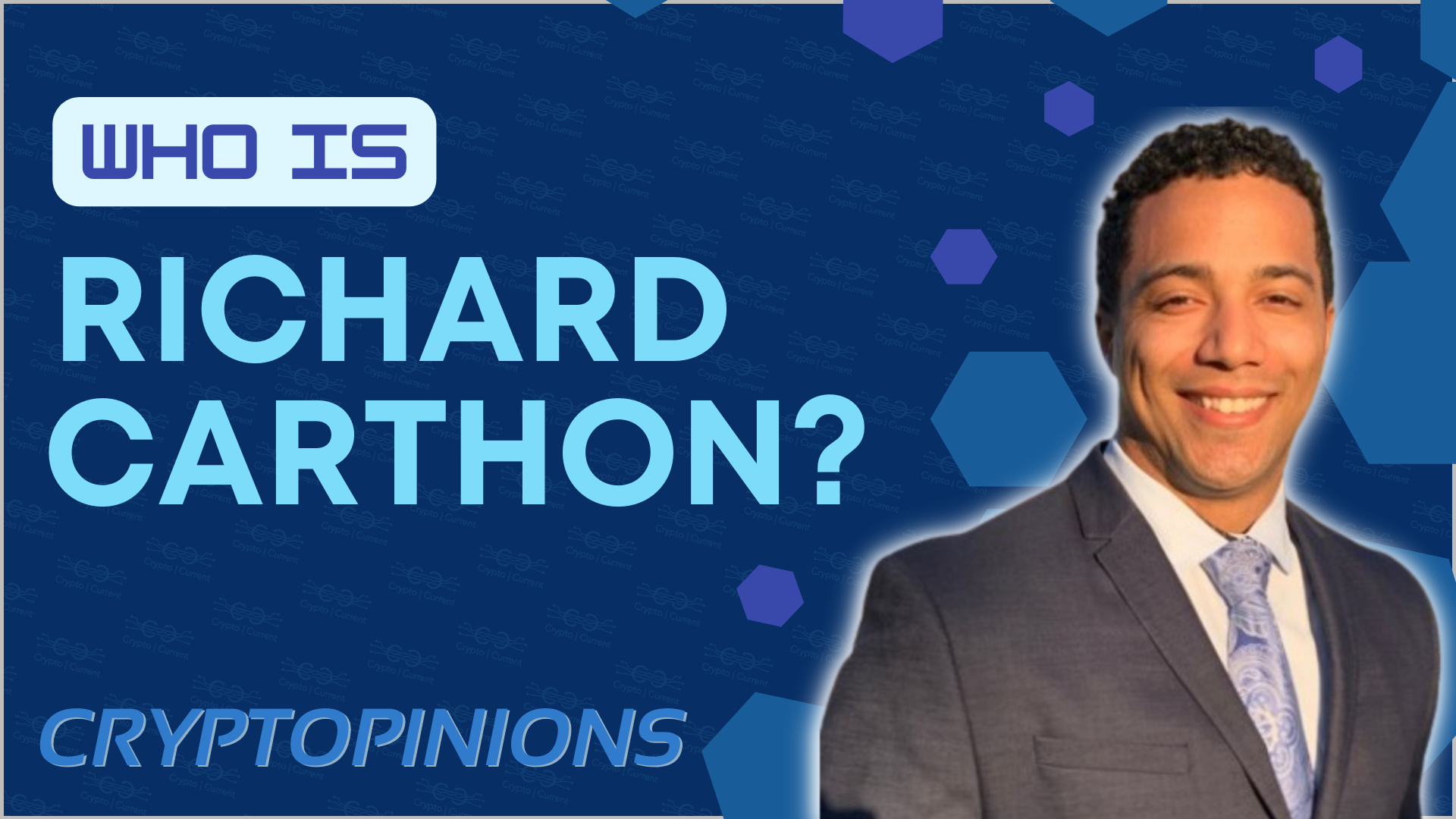
3. Thumbnail for Richard Carthon Info Post
For this thumbnail, created as an informational piece about Richard Carthon, I followed the company's standard thumbnail creation process. Given a specific background, color palette, and a preferred photo of Richard, I was tasked with making subtle enhancements. To add depth and a modern touch, I integrated hexagonal patterns into the background and opted for a minimalistic layout with tech-inspired fonts. This project reflected my ability to apply a sleek and professional aesthetic tailored to the cryptocurrency sector.
4. Graphic for YouTube Crypto Information Channels
This design was developed to highlight recommended YouTube channels for crypto enthusiasts. Using licensed 3D assets, I crafted a clean and simple layout with left-aligned text to ensure clarity and focus. The bold, eye-catching fonts, along with a glowing effect behind the letters, added visual intrigue, aligning with the client's desire for dynamic and engaging designs. A 3D YouTube logo paired with a 3D Bitcoin asset created a cohesive and thematic representation of the content.
Each of these projects showcases my versatility in graphic design, adherence to brand guidelines, and creativity in bringing diverse concepts to life. My work with Crypto Current allowed me to explore different design tools and techniques, resulting in visuals that effectively communicate the brand's message and resonate with their audience.
Product Design
〰️
Product Design 〰️
Product Package Design
My approach to packaging design combines storytelling with a keen attention to detail, using bright colors and unique design elements to create visually striking packaging that stands out. I craft packaging that is not only eye-catching, but also tells a compelling story that resonates with consumers. By utilizing tools like Adobe Illustrator, Canva, Procreate, and Affinity Designer, I blend digital precision with creative innovation to produce designs that capture the essence of the product and engage consumers on an emotional level.
Watchin UUU.... Hair dye Design Concept - Inspired by Chappel Roan - Adobe Illustrator and Canva Mockups - 2024
This project is a conceptual product design inspired by the dynamic and evocative lyrics of Chappell Roan's song "My Kink is Karma." As a graphic design exercise, I set out to create a product that captures the essence of the song’s themes and the artist's bold persona. The product, a vibrant red hair dye, draws directly from a lyric in the song: "...people think I'm jealous but my kink is watchinnn youuuuu..." where Chappell's playful yet provocative tone suggests a mix of intrigue and self-assurance.
The choice of hair dye as the product was inspired by another verse in which Chappell mentions someone "dyeing their hair." This nod to transformation and self-expression felt like a perfect metaphor for the song's narrative of reinvention and self-realization. The color red is not just a reflection of Chappell's iconic hair but also symbolizes passion, intensity, and a touch of rebelliousness—all characteristics that resonate with her music and persona.
In the design, I utilized rough, cut-out letters to evoke a sense of rawness and edginess, aligning with the audacious energy of Chappell's sound. The eye logo, placed prominently around the lid, is a visual representation of the lyric and product name. This element further emphasizes the theme of observation and insight, giving the packaging a contemporary and "boho" flair that is both unique and attention-grabbing.
The decision to title this specific shade as #8 is a subtle yet intentional reference to the song, creating a layered experience for those familiar with Chappell Roan's work. This design is not just about creating a product but about encapsulating a moment of artistic expression—melding music, visual art, and personal identity into a singular, cohesive experience. Through this project, I aimed to explore the intersection of graphic design and music, using visual storytelling to translate the emotional depth and distinct style of Chappell Roan into a tangible form.
Client: N/A
Year: 2024
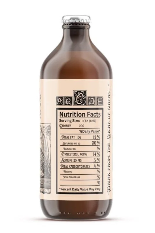
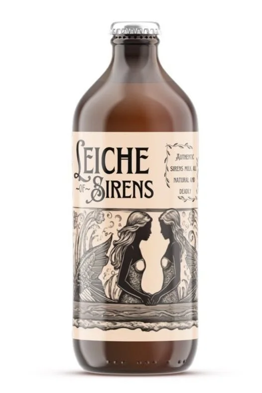
Leiche of Sirens, Milk Bottle Design Concept- Inspired by Melanie Martinez- Milk of the Sirens- Adobe Illustrator and Canva Mockups - 2024
This is a conceptual product I designed as a graphic design exercise, inspired by Melanie Martinez's haunting song "Milk of the Siren" from her third album, Portals. After I experienced the magic of seeing this song performed live in November 2023, I felt compelled to bring the song's eerie beauty to life. The live performance was mesmerizing, casting a spell on me that lingered long after the concert ended. The tune echoed in my mind for days, inspiring me to imagine what "Leiche of Sirens," a fictional product inspired by the song’s themes, might look like if it existed as a tangible product you could buy.
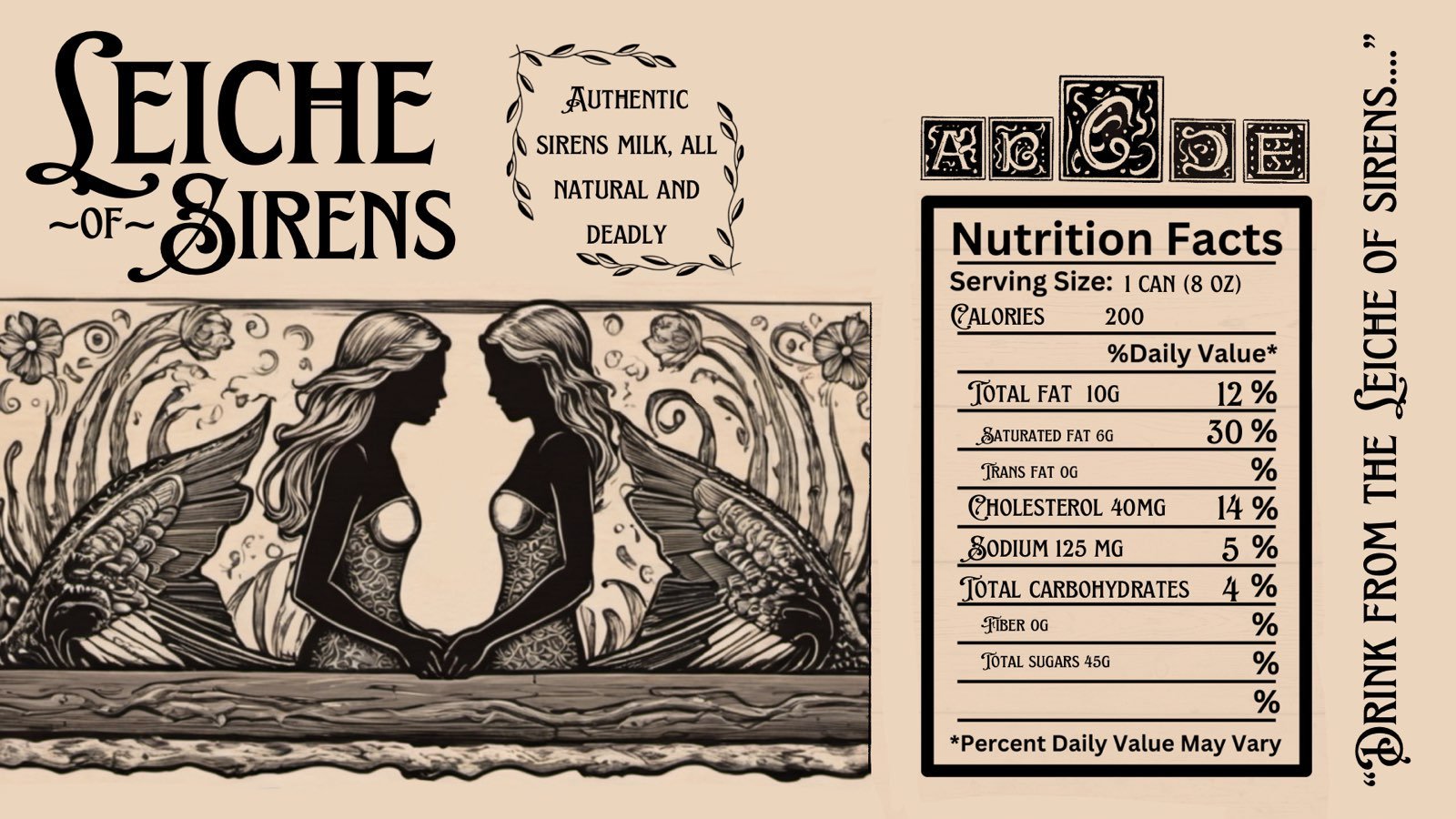
I envisioned a design that exudes the charm of vintage antiques, evoking the mystique of medieval Britain. Drawing inspiration from the lore of pirates and sailors, I chose a label color reminiscent of a weathered treasure map, a nod to the maritime legends that inspired the song. To reinforce the vintage aesthetic, I crafted the text using old typefaces, shaping it to echo the timeworn elegance of the past.
The centerpiece of the design is an image of two mermaids, crafted with Midjourney and then meticulously refined to achieve a polished, cohesive look. Near the nutrition facts, I reimagined the German Nutri Score in a medieval style, sketching out custom letterheads in Procreate to maintain the immersive experience.
I added evocative quotes around the bottle, including one that reads, "Drink from the Leiche of Sirens"; a direct lyric from the song, and another stating, "Authentic sirens milk, all-natural and deadly," capturing the song's theme of luring in predators only to seal their fate. The entire layout was meticulously designed in Adobe Illustrator before being applied to Canva’s mockup tool. I selected a brown bottle for the packaging, which not only enhances the vintage feel but also resembles an old-fashioned milk bottle, reminiscent of those found at quaint local markets.
Client: N/A
Year: 2024
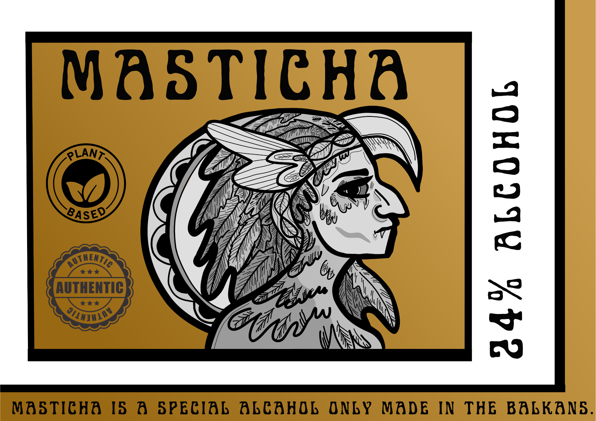
Masticha Bottle Design Concept- Inspired by the legend of the Harpy- Affinity Designer
Client: N/A
Year: 2022
In my Editorial Illustration class, I completed a project that combined illustration and graphic design. The assignment was to create a product inspired by a mythical creature. For this project, I chose the Harpy, a figure from Mediterranean folklore familiar in ancient Greek literature. Drawing inspiration from this mythical creature, I developed a packaging design for Harpy Branded Mastiha, a traditional Balkan liquor known for its unique flavor and cultural significance in Greece and other Balkan regions.
For the design, I incorporated a psychedelic, 1960s-inspired font to reflect the Harpy's free-spirited and independent nature. This font style also connects to the bold, expressive aesthetics of the sixties, evoking a sense of empowerment and liberation. This psychedelic theme is carried throughout the design, with elements that echo ancient Greek art and styles, seamlessly blending historical motifs with a modern twist.
Gold was chosen as the primary color to pay homage to ancient Greek art and culture, adding a sense of luxury and tradition to the packaging. The label’s rectangular, boxy shape was selected to reference geometric styles commonly seen in ancient Greek design, enhancing the sense of a refined, classic seal. This choice adds to the overall visual impact of the packaging, creating a strong and distinctive brand identity for the product.
The design was created using Affinity Designer 2.0, allowing for detailed and precise execution of the concept. The final packaging design effectively merges mythical storytelling with contemporary design elements, resulting in a unique and visually striking product that captures both the essence of the Harpy and the cultural richness of Mastiha.


